To The Archives

Tuesday, November 22, 2011

CON EL CORAZON ROTOSCOPIADO.

After 48 hours without sleep I finally finished and shot all 120 drawings (10 seconds) for my rotoscopy assignment.

For those who don't know, Rotoscopy is an animation technique where you trace a video source for movement reference.

FYI: This technique was patented by the Fleischer bros, the same guys that did Betty boop, Popeye and Superman Cartoons.


This is the first time I've been able to do rotoscopy with pen and paper... Over the monitor.


There is still a lot of work to do for the video to be ready, but I wanted to share my favorite images from the bunch as a teaser of what's to come.


Possibilities are endless.

Friday, October 28, 2011

STRAIGHT AHEADS 1.2.3

Post #100. And I don't have anything special prepared for it.
So I guess I'll do something special for the 101th post.

For now... I'm trying to get a better and more intuitive sense of timing and movement so I decided to make this straight ahead improv animation for fun and training.

Like my friend Andrew called them...Push ups for animation. I liked that.


Straight Ahead 1 Straight Ahead 2 Straight Ahead 3

Sunday, October 16, 2011

GRANPAD: THE RACIST TABLET


My iPad refuses to read some languages. I am beginning to think It could be a little racist.

This flaw, an article I just read about racism in cartoons during the 30's and the Colombian conservative party gave me the inspiration to create this character.

I think it has a lot of possibilities in this world of ours...we'll see.

Tuesday, October 4, 2011

AMERICAN GODS POSTER: CHERNABOG & THE ZORYA

AMERICAN GODS: CHERNABOG & THE ZORYA

 On chapter four of the book AMERICAN GODS by Neil Gaiman. Shadow (The main character) and Wednesday (his boss) visit the apartment of the Zorya sisters seeking the aid of Chernabog. The slavic deities are related with light and sky. Zorya Utrennyaya is the Morning Star, Zorya Vechernyaya—the Evening Star and Zorya Polunochnaya, the Midnight Star.

 This illustration was made for the SUPER PUNCH AMERICAN GODS JAM. 

 Check the Black & White Version.

Thanks!
Read the book.

Wednesday, September 14, 2011

LUKEEN 4 YOB


For Basic Production Techniques class...
Is good to be back.

Tuesday, September 6, 2011

BACK TO BASICS.

So, I moved to L.A in August to start my MFA at USC.

I just spent most of the previous month, and then some, getting things in order. So I haven't been able to do or post anything.

However, class exercises are starting to come about, so I'll try to make some cool things to post.
but I must warn you...I'm pretty rusty with non digital techniques. So, let's see...

I begin with a Zoetrope exercise.


Here are some animated gifs showing how the thing ended up looking.
(Click them to see the animation)

1. Face (Frame by frame)


2. Face (With a blur)


Sunday, June 19, 2011

THE HOUND OF THE EMPIRE

You should not sketch the dog of the venezuelan ambassador at the 7th avenue with 85th street in Bogotá, because the police immediately comes to bother. 


Under the gray sky of Bogotá, some quick sketches of people exercise in the 7th Avenue Bikeway (ciclovía).

Monday, June 6, 2011

IT ONLY RAINS IN PANAMA II


This is the view from my room in Clayton, Panama City.

It's not the same house from when I painted this

Friday, May 20, 2011

ROSIE THE ROBOTEER


ROSIE THE ROBOTEER.

This is the cover I did for PROYECTO DISEÑO MAGAZINE #72 XIV LAPIZ DE ACERO (steel pencil) AWARD NOMINEES Edition.

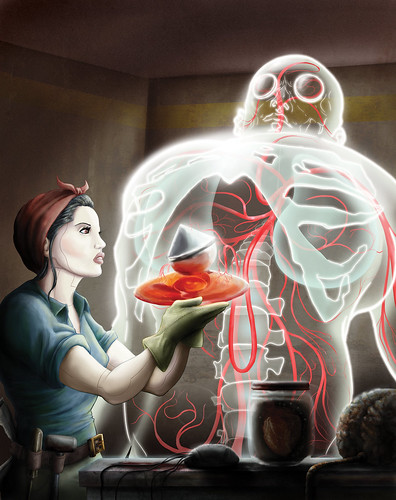
This is a simple story. I was asked to do a cover with the only condition that I should include the "Lapiz de Acero" statuette in the image. I did four proposals for this cover.


1. War of the worlds 2.Space Oddysey
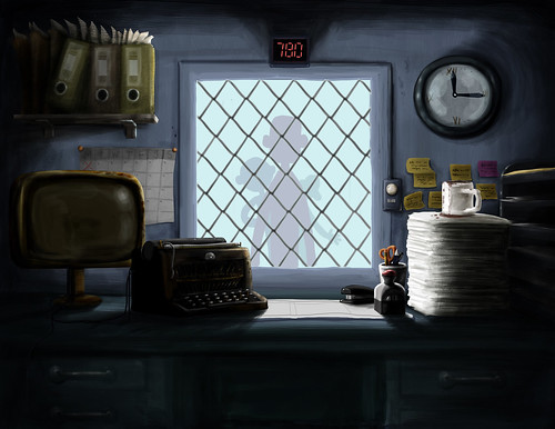
3. Steampunk 4. The window.


For some people it may be kind of obvious that most images come from some specific references. I have a lot of baggage in my head.

Fortunately my friend (and sometimes mentor) Andres Barrientos, one of Colombia's best illustrators, gave me some advice on the management of cliches in the image. So, I subverted the meaning of the images. Woman building robot, turned into Robot building human. Giving life with the afore mentioned Statuette.


I worked mostly on lights and transparencies. Not so much on textures. I gave it an over all shadow that turned it a bit "baroque" at the end.

Here are some shots of the PROYECTO DISEÑO stand at the FERIA DEL LIBRO BOGOTÁ 2011.


And a shot of the inside article they did about my work


And now, it's been featured in SUPER PUNCH :D

Really nice.
Thanks for reading.

(Thanks to Paula, Juan Felipe, Adriana, Santiago, Javier, Another Santiago and Andres, Willy, Gustavo, Emiliana, Camila, Blanca) who took the time to give me their opinion.

Tuesday, April 26, 2011

HOW TO COOK A RAMEN CUP OF NOODLES

CÓMO COCINAR UNA TAZA DE RAMEN // HOW TO COOK A RAMEN CUP

My Friend Catalina Alba, author of the Blog www.loquesecocinaenestacasa.com invited me to participate in her website with an illustrated recipe. Very kindly she describes the process that produced this result. You should visit her site (with google translate) because it's pretty useful and the presentation it's so nice. 


Now, onto the Image.


For this image, I tried to concentrate  mostly on creative layout, which I think is one of the main (and sometimes overlooked) strengths of comic books. The challenge was to squeeze the biggest amount of story into the image, making the most of the spaces. 


Also, I used a lot of sinuous patterns to complete and make a more dynamic image, sort of referencing early Japanese design. 


For those of you who don't know, FLYING SPAGHETTI MONSTER is a very popular deity on the Internet.
It was invented by some guy challenging the feasibility of god and satirically pointing that he might as well pray to a flying spaghetti monster. 

Previously I posted the Lettering design for FLYING SPAGHETTI MONSTER . Inspired, obviously, by Ultraman's Font design.

HERE ARE SOME STEPS OF THE PROCESS.

Step one. Pencil Layout


Step two. First Clean up.


Thanks for watching.

Update:::::::


Saturday, March 5, 2011

THE LITTLE TYRANT NEWSLETTER

So, we finally came back with the third season of the series.
And I designed a newsletter for email distribution.

"El Pequeño Tirano" Newsletter

FULL SIZE

You can go visit the website and watch the whole series there.

Friday, February 11, 2011

TYPO Exercise

I'm doing a comic and trying to design all the lettering.
here's the first result...

Sunday, February 6, 2011

LA RECONTRA Celebrates the YEAR OF THE RABBIT.

I do live video for an event called LA RECONTRA. 
Here are three loops from last party celebrating 2011, the year of the rabbit.
Click Through to watch them move.


Enjoy!

Monday, January 31, 2011

THE ETERNAL (and very heavy) FALL.


If you want to watch this very relaxing animated gif, you have to click the image and wait for the 3.4 MB it takes for the animation to load.

The Office (Concept Art)

The Office. (Concept Design)

For an animated short I am developing.

Saturday, January 22, 2011

APARTMENTS: 5 YEARS AFTER/ 5 YEARS LATER


Apartment Number $ - The Shaman. (2006)
from Simonwilchesc on Vimeo.

In 2005 I started developing my graduation project. It was a
15min animated short consisting of 4 pieces in different techniques.

At the time; there were many things I did not know, could not do,
or never took into account while developing the project.

I decided, for many reasons, to give it a second look and try to fix
some of the technical shortcomings of the piece. I have been working
on it the past two months. This is sort of the result:


I am pretty satisfied with the results. They are not perfect by any
means, however these show some of the skills I have come to
learn these past years. 

MORAL: Never be absolutely satisfied with anything you do. 
There will always be room for learning and improvement. 

Thank you for Watching.

Simón.