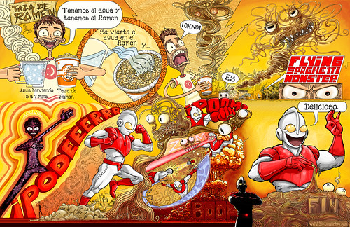
My Friend Catalina Alba, author of the Blog www.loquesecocinaenestacasa.com invited me to participate in her website with an illustrated recipe. Very kindly she describes the process that produced this result. You should visit her site (with google translate) because it's pretty useful and the presentation it's so nice.
Now, onto the Image.
For this image, I tried to concentrate mostly on creative layout, which I think is one of the main (and sometimes overlooked) strengths of comic books. The challenge was to squeeze the biggest amount of story into the image, making the most of the spaces.


Also, I used a lot of sinuous patterns to complete and make a more dynamic image, sort of referencing early Japanese design.
For those of you who don't know, FLYING SPAGHETTI MONSTER is a very popular deity on the Internet.
It was invented by some guy challenging the feasibility of god and satirically pointing that he might as well pray to a flying spaghetti monster.
Previously I posted the Lettering design for FLYING SPAGHETTI MONSTER . Inspired, obviously, by Ultraman's Font design.
Step one. Pencil Layout
Step two. First Clean up.
Thanks for watching.
Update:::::::


No comments:
Post a Comment